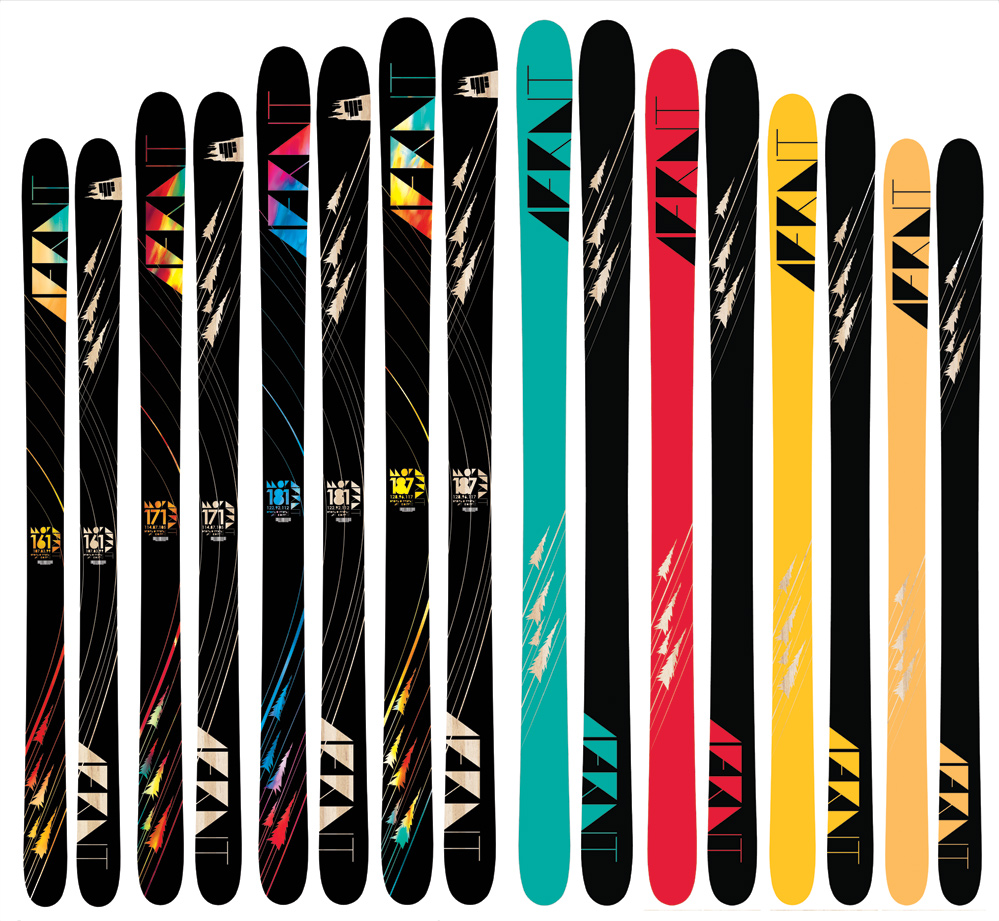
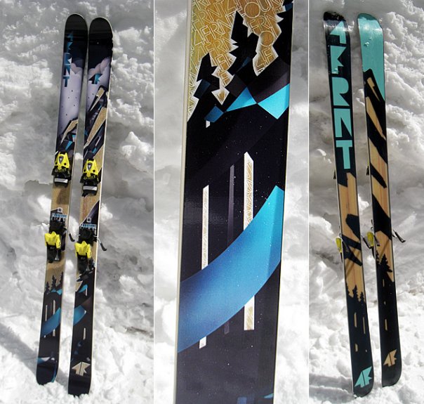
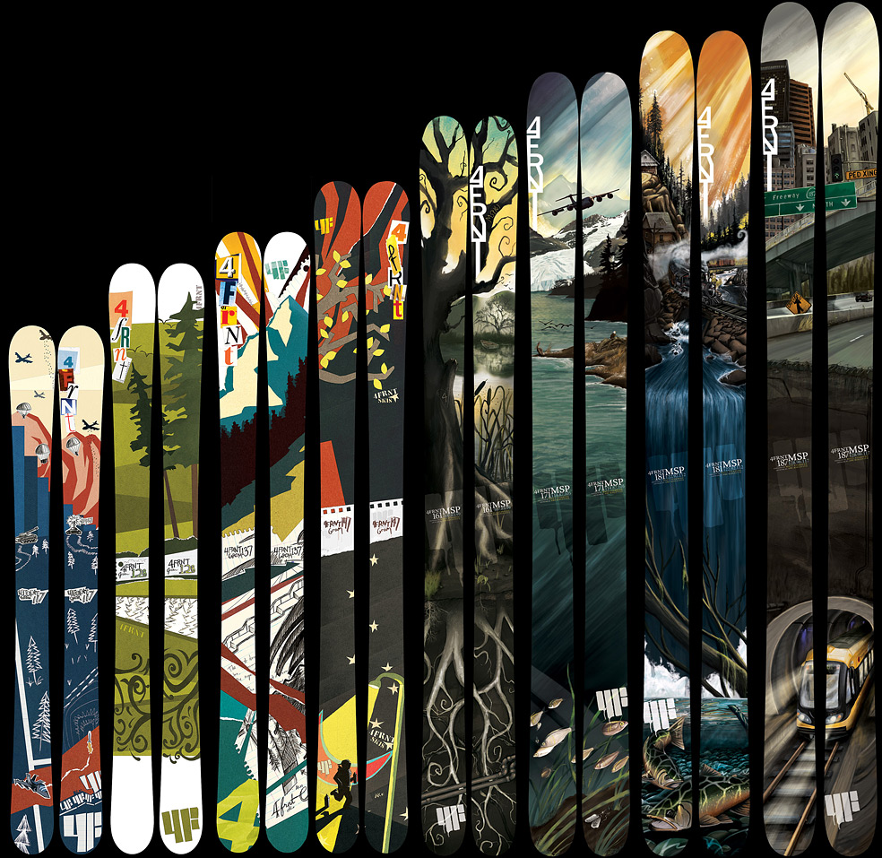
For the past 8 years I’ve been creating top-sheet ski graphics for 4FRNT Skis. I started my first designs right after I gradated high school in 2005 and have been doing it ever since. To date I’ve designed around 45 different graphics of varying lines of skis over the years. My longest run was 6 years of the 4FRNT MSP ski, their premiere all mountain ski that was discontinued last year. Since then I’ve picked up designing the Switchblade over the last 2 years – their primary park ski. Below are my designs for the 2013-2014 line of Switchblades.
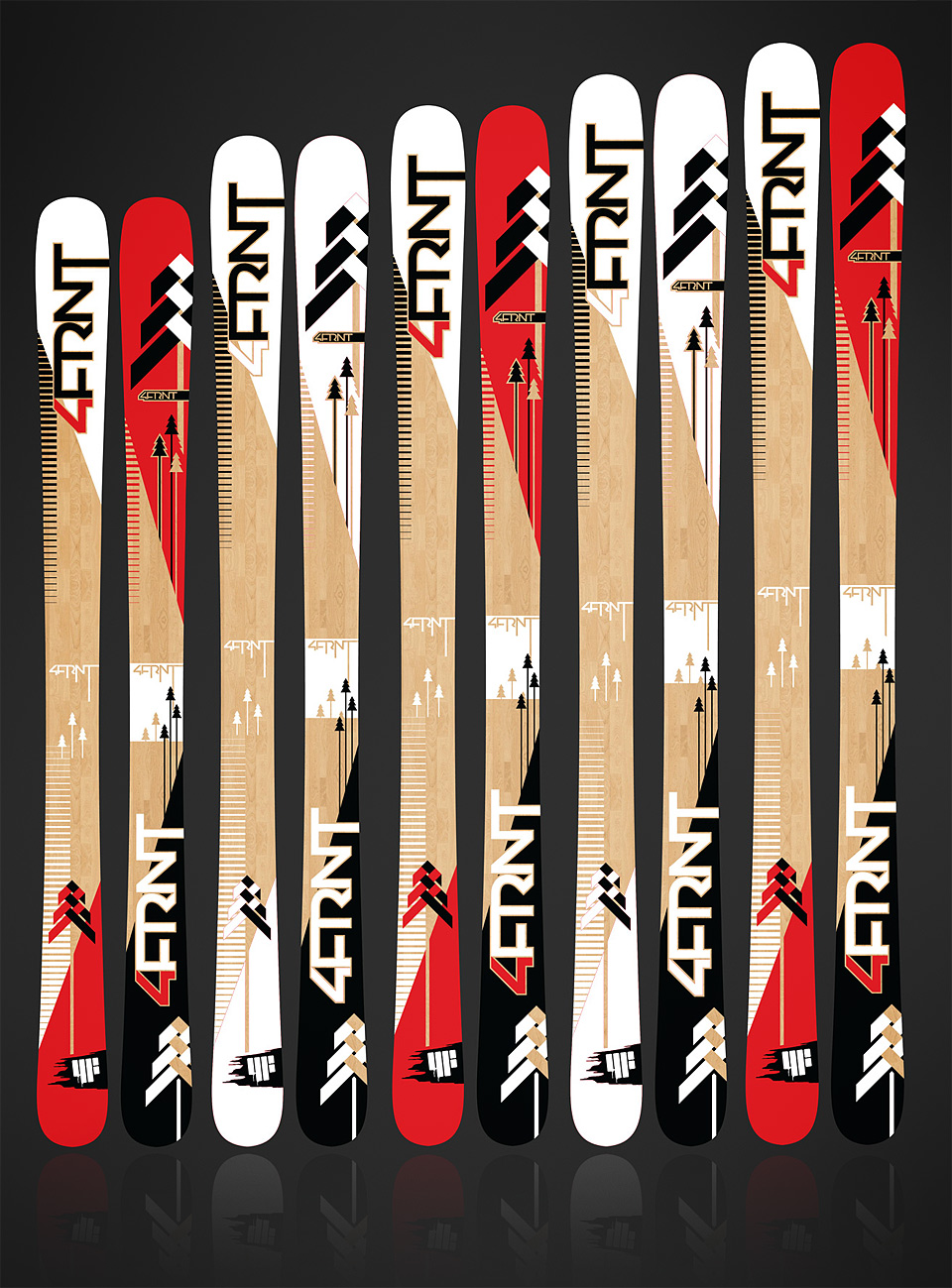
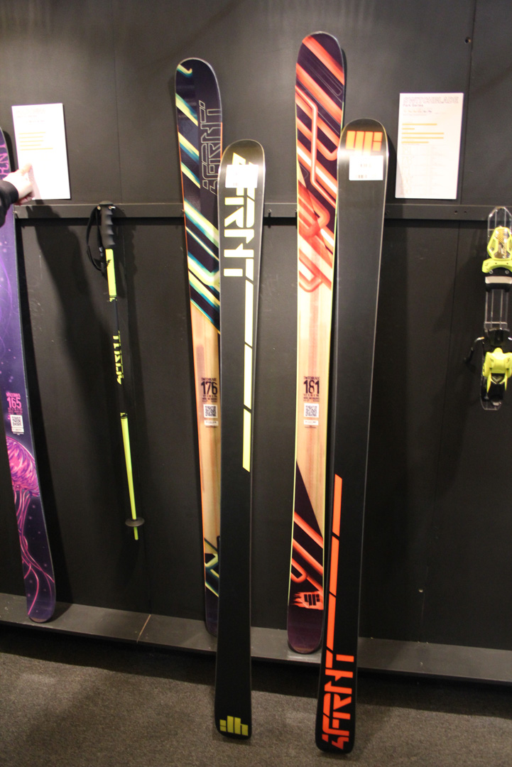
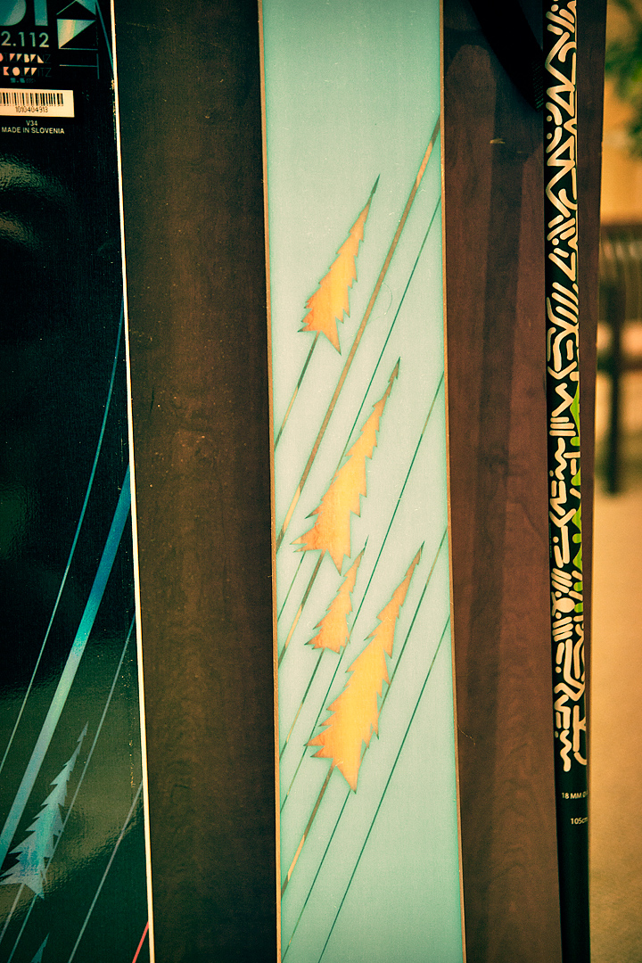
The skis this year are a little more basic but I focused a lot on materials and ski layers. They were designed entirely using Adobe Illustrator and were exported to be all screened layers rather than sublimated (printed) layers. The advantage to having vector graphics and screened layers is crisp lines and more versatility with materials. You’ll see there are windows straight to the natural wood core, there’s gloss overlays and then separate matte overlays so when you look at the ski in the sun or light it’ll reflect light in different ways at different places. It’s tough to get an idea of what the skis will really look like until I get photos of them in person.
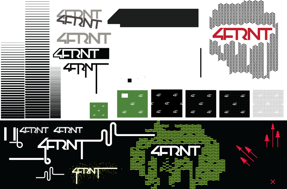
Depending on the graphics and artwork, there’s always a different creative process that goes into the making of the skis. For me this year I started in Photoshop and sketched out ideas for how I wanted the text and logos to look. Once I drew out a few solid ideas, I took those sketches into Illustrator and traced them out to be made into vector graphics. This way all my logos are custom made and not created from pre-made fonts. Once I had the logo design in Illustrator I started toying with different ideas for elements that could go into the skis. I know I wanted to do something with solid lines & trees interacting with the natural wood core. I created a large sandbox of design elements that I could pull from and see how they worked in various locations on the ski template. Below is a little piece of my sandbox design file.
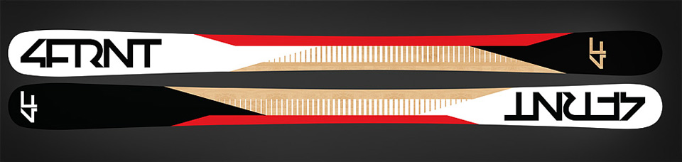
From there it just took a lot of messing with shapes and colors to find the right path. I couldn’t decide whether I liked all black and white or the black – red – white versions so I decided to alternate the color scheme depending on length. Here’s a secret – I always try to make my favorite graphic or color scheme in my size (175-180). I’m pretty sure it’s the most commonly sold length for that ski so it’s a good guide to go with my gut for the most popular length! It usually takes about 2 weeks of working nights to get a design to where I want it to be. The thing about graphics is it’s hard to bust it out and be happy with the first round. I usually have to sit with a set of graphics for a few days and tinker with things until I get to a spot where I’m happier with the results. Once the final graphics are complete I take design elements from the topsheets and begin designing the bases. The bases are usually simple designs that will look good in photos from afar. Pro athletes are often photographed from below while they’re in the air so the bases get a lot of facetime. Logos are first and foremost the focus with design elements coming in 2nd. I was pretty stoked on these bases; however, I haven’t seen the final skis in person so I’m not sure if they got changed slightly. These bases are also vector designs and will be di-cut of different materials including clear base material showing the wood core.
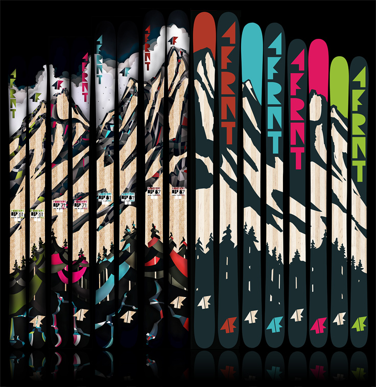
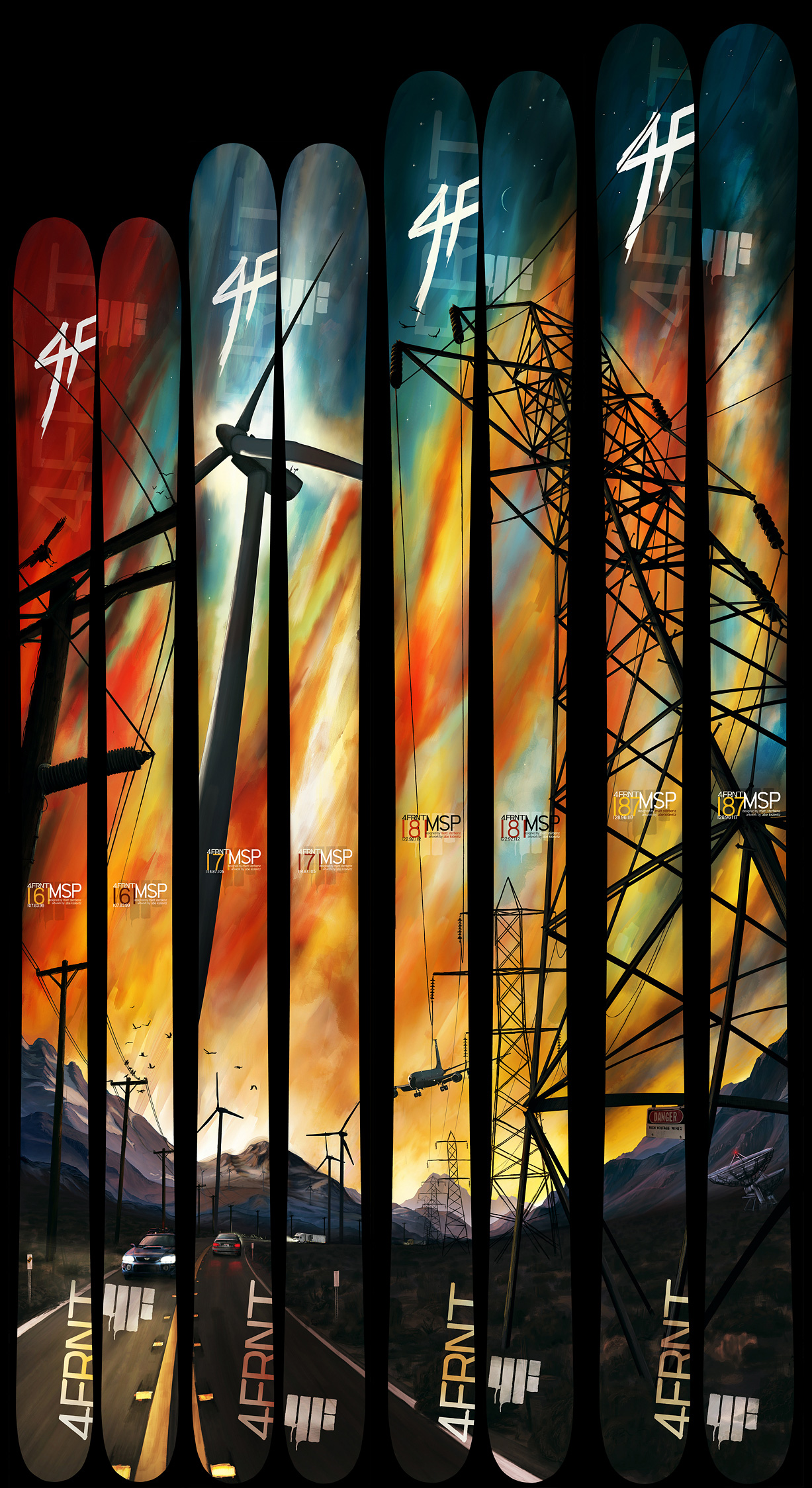
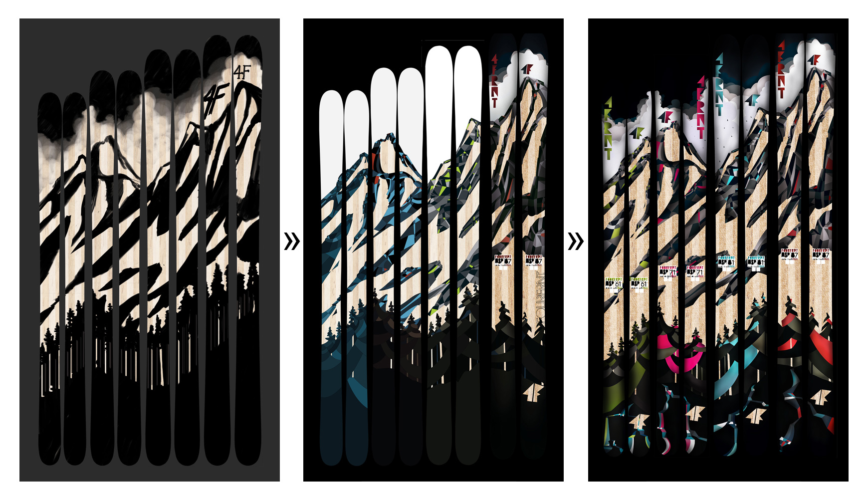
It’s fun to look at the creative process from start to finish. Take the MSP models I designed from 2011 for example. These ones I actually had a pretty clear idea from the start what I wanted, but just knew it would be a process. I wanted a full mountain scene across all of the skis but have a stained glass sort of look made from a ton of little shapes. Up close it would be very geometric – from afar it would look mural-esque. I started by sketching out a scene in Photoshop (I use a Wacom Intuos tablet for my sketching). I left areas where the wood core of the skis would show through as the ‘snow-cover’ on the mountains. From the first rough sketch I refined it a bit then imported the design into Illustrator. In Illustrator I started from the top down on each ski and just went to town with the pen tool creating shapes that were all connected. I’d pick about 4 different shades of gray to fill in all of the geometric shapes and one bright color. The bright color would be the ‘theme color’ for the ski and show up in the logos and what not. Once all of my shapes were finished it was back to photoshop to add shading and refine the design. This is also where I’d add elements for the printing. These skis in particular had a screen printed white layer directly on the wood behind the entire graphic with small 4FRNT text repeating across the whole ski. The hardest part back then was working with enormous files in Photoshop. This was back before my computing needs were supported by GoPro so I was running off of the computers I could afford after I was finished paying for food/college/housing. I’m sure many can relate! Spinning wheel of death anyone?
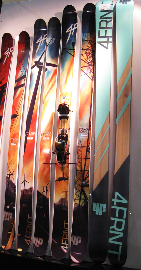
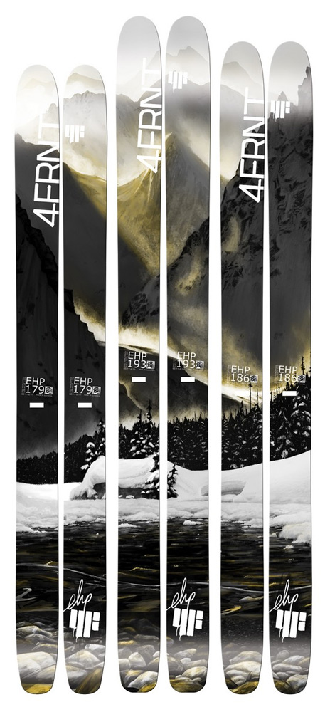
If you haven’t seen my other designs check out some of the photos below from years past.